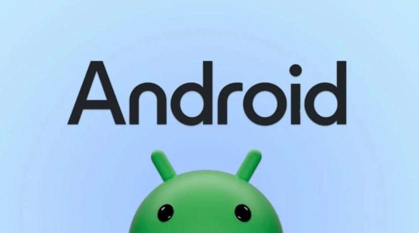
As the release of Android 14 approaches, Google has updated the design of the Android logo and associated branding to achieve a more modern look. This new design comes several years after its last update in 2019. Google states that the overarching goal of this redesign is to better connect Android with Google. The Android text logo now begins with a capital letter for the first alphabet. This adds weight to the logo and makes it visually appealing alongside the Google logo.
Previously, the company used lowercase letters for the Android text logo, and even the Android robot logo now appears three-dimensional. Google says they drew inspiration from the Material You design language for the new logo. This complements Google’s color palette and can adapt to various colors, similar to Material You.

Google mentions that whenever the company overhauls its branding, they not only assess changing needs but also future goals. “We know people today want more choices and autonomy, and we want our brand to reflect Android: something that empowers people to create as they wish. As an open platform, it’s important for our technology and brand to be an invitation for people to be creative, connect, and do more with Google on Android devices,” says Google.
The Android robot, also known as the bugdroid, has received a new look as well. It now has a three-dimensional appearance. Google says this gives the robot “more dimensions and more character.” Inspired by Material You, this full-featured Android robot can adapt to various materials, textures, and even accessories. You will begin to see this new Android logo this year in various places, including smartphones, tablets, smartwatches, and TVs.


